
Behind the website · A Designquik case study
A clear path to
personal guidance.
Website design for Virginia Harris Enterprise: bringing tax preparation, health insurance, and life insurance into one calm, personal experience.
Explore the design decisions ↓- The business
- Virginia Harris Enterprise
Atlanta, Georgia - Design & development
- Designquik
- The focus
- Clarity, personal connection,
and a useful next step
01 · The starting point
One business.
Distinct reasons
to visit.
People arrive at Virginia Harris Enterprise with different questions. Some need help preparing a return. Others are exploring health coverage or protecting their family with life insurance. The website needs to introduce Virginia, explain those services, and make it clear how to reach her.
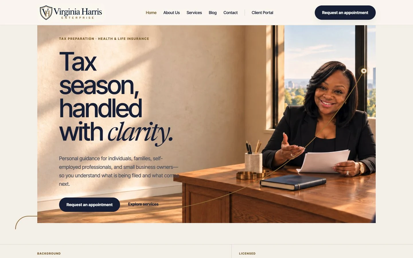
Designquik organized the experience around those tasks. Tax preparation leads the homepage, while health and life insurance each have their own visible path. The design gives each service room to explain what it offers without making visitors sort through an undifferentiated list.
02 · The design decisions
Professional, with a person at the center.
A calm visual language
Navy gives the site structure, warm ivory softens the page, and brass accents guide attention. Direct typography carries the practical information; italic serif phrases add a more personal voice. Numbered sections and fine rules create a readable sequence through a long homepage.
Virginia’s story, in context
The homepage introduces the person behind the business and leads into Virginia’s story. Her background and approach sit alongside the service information, helping visitors understand who they will speak with before requesting an appointment.
Details before the decision
Dedicated service pages and a plain-language resource library provide more depth. Visitors can move from a broad service category to the subject that fits their situation, then return to a clear contact action.
03 · Visitor paths
Make the next step
easy to find.
Navigation follows what people came to do. The same service, contact, and portal destinations remain accessible across desktop and phone layouts.
- 01
Find the right service
Start with tax preparation, health insurance, or life insurance, then explore the relevant details.
- 02
Request a conversation
The appointment request, phone, and email offer direct ways to reach Virginia. Preferred call windows are presented as requests; Virginia follows up to arrange the appointment.
- 03
Keep documents in the right place
The Client Tax Portal has a distinct, persistent link. The inquiry form asks for contact details and a short message, while tax documents belong in the secure portal.
04 · Across screens
The same clarity.
A different layout.
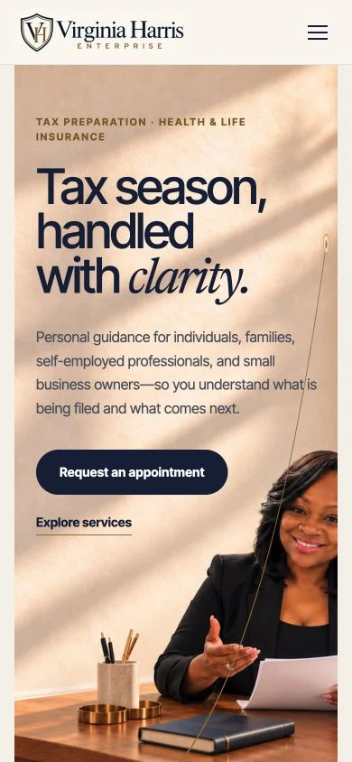
On a phone, the navigation becomes a compact menu and the service rows and content sections stack vertically. The message and appointment action stay prominent. The layout changes to suit the available space while preserving the order of information and the paths into the business.
Explore the Virginia Harris Enterprise website →
The studio behind the website
Websites built
to last.
Designquik brought the website’s structure, visual design, content presentation, and responsive development together around Virginia’s tax preparation and insurance business.
For more about the team behind this project, visit Designquik for website design and development.
Here for tax preparation or insurance?
Contact Virginia →